Topics
Worst Windows security flaw yet (updated)
Update: Microsoft has now released their official patch for the Windows Metafile security flaw. For detailed information, see the ISC report.
(outdated content from 2006-01-03)
In case you don’t already know about it, the new Windows Metafile security flaw is a nasty one. Do not wait for the Microsoft patch due next week. Protect your system now with Ilfak Guilfanov’s unofficial patch. After installing the patch, you can test your system to confirm that the bug is fixed. (Click on the Kevin Gennuso link on that page to open a .wmf file that attempts to start calc.exe. If you get a normal Windows Picture and Fax Viewer window instead of calc.exe, you are good to go.)
After Microsoft’s official patch is released, you can uninstall the unofficial patch.
I didn’t review the code for the unofficial patch, but people who did review it describe how it works in the WMF FAQ. The patch works just the way I would have coded it myself.
The FAQ also recommends unregistering shimgvw.dll in addition to the patch. I don’t think this is necessary, but it wouldn’t hurt.
Zach Harkey code test
GeSHi filter test, changing languages in midstream.
Source code:
<geshi php>
<?php if ($links): ?>
<geshi html4strict />
<div class="links"> <geshi php /><?php print $links ?><geshi html4strict /> </div>
<geshi php />
<?php endif; ?>
</geshi>
Result:
Blog on Drupal now
We’re up and running with a Drupal version of the blog now. This probably means the RSS feeds will have duplicate entries—and that may happen again as I do some touchup editing to make the old entries display correctly. Sorry about that!
One of the deciding factors was the slick GeSHi syntax highlighter, which I tweaked up a bit to do zebra stripes. Those really help keep code readable when lines wrap in a narrow window. Check out the code samples in this page, and try making the window narrow to see the zebra stripes do their thing. (Alas, they only appear when you go to the site, not in the RSS feed.)
The code syntax highlighting works in comments too. I may change the <geshi> tag; that’s a bit of an experiment to get GeSHi and Markdown to work together.
More about the conversion later, time to call it a night!
WordPress spam fiasco
I’ve been thinking about moving this blog from WordPress to Drupal. I use Drupal for other sites, and with some of the contributed modules it has features that would be handy here.
Last week I ran a test conversion using Sam Revitch’s WordPress-to-Drupal conversion script. Everything carried over to Drupal beautifully, even the custom URL setup, but I noticed there were nearly 2000 comments in Drupal—a lot more than I’d ever seen on the blog or in the WordPress admin pages. I looked in the WordPress database with phpMyAdmin and found the extra comments in there, flagged with comment_approved = spam. Most of those really were spam, but there were a couple dozen legitimate comments that had been mistakenly tagged as spam.
That wouldn’t be so bad if the WordPress admin UI had given me any clue that these false positives (and the actual spam comments) were hiding in the database. But they don’t show up anywhere in the admin pages. The first time I ever noticed them was when the conversion script copied them over. (I suppose that could be considered a bug in the script—should it copy spam-tagged comments? But I’m glad it happened or the comments might have been lost completely.)
So, to the couple dozen people who posted comments and never saw them appear (nor any reply from me or anyone else), my sincere apology. They will show up when I straighten this out.
That would have been a week ago, except that once I saw the blog in Drupal, I asked myself if I was sure I didn’t want to try Typo—mainly because I’ve been itching to do something with Ruby on Rails, and a good way to learn a new language or framework is to start with an existing application and make some changes to it.
So far the results are mixed. Typo is a lot of fun and it has most of what I need in a blog, and coding some of the missing features would be educational. Actually getting to where you can test and deploy a Rails app like Typo is a total pain. With Drupal (or WordPress) I can have a basic site up and running in a few minutes on just about any hosting setup—including XAMPP on any handy Windows PC. Just unpack the tarball, edit the configuration file, create the database, and go to town.
But even on a Rails-friendly host like TextDrive, setting up a Rails app is downright scary, at least if you use Lighttpd like everyone says you should. I can see where there’s a market for a specialized hosting service like RailsAppHosting!
I couldn’t get Typo to run reliably on a Windows machine, so I built a Debian virtual machine and have been running it there. But it freezes many times a day. It won’t load any pages, nothing shows up in the console log. Other apps on the Debian machine respond normally. After a minute or two, Typo wakes up from where it left off. I figured this is probably just something about the virtual machine, maybe the fact I’m running Rails under Webrick or something, but then I saw this thread on TextDrive which has me worried.
I suppose I could just fire up the Drupal site and be done with it, and find some other project to learn Rails with.
Goodbye Adobe
![]() After three and a half years at Adobe, I left the company this summer. Basically, I got fired.
After three and a half years at Adobe, I left the company this summer. Basically, I got fired.
It’s a long story, which I will tell someday. In the meantime, I wanted to apologize to anyone who was looking for the next thrilling installment of the Ajax-style PDF series. As you can guess, my enthusiasm for anything Acrobat has been muted slightly.
But, enough waiting around, I will get back to it and post part 2 soon…
My Scobelized Bogen
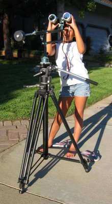
Before Robert Scoble was a famous blogger, he worked at a great little camera and appliance store in San Jose called LZ Premiums. I used to stop by the store and annoy Robert because I hardly ever bought anything. (I wasn’t checking out the prices and then going off to the competition to buy, honest! Just enjoyed window shopping.)
Finally, one day I ordered a nice Bogen/Manfrotto 3246 tripod with the 3063 mini fluid head. It’s funny how some things stick in your mind: I remember vividly the smile on Robert’s face when I came in to pick up the tripod and he brought it out for me. At last, I had bought something!
I still have the tripod, and it’s served me well all these years. Besides video, it makes a great platform for a binocular mount. In the photo, my daughter Rachel is using it to view that great sunspot cluster that appeared a year ago. (Yes, those are proper solar filters on the binoculars, and it is perfectly safe to look at the sun through them.)
Why am I posting this today? Robert offered to put people’s blogs on the computers at the PDC, so just in case he actually gets a chance to do mine, this is a little tip of the hat. :-)
Why do large displays have so few pixels?
Engadget loves big LCD monitors, and today they are reporting on the Philips 190PX and 200W6.
At 19” and 20.1” diagonal size, these displays are big, all right, but so are the pixels.
The 200W6 has 1680x1050 pixels, or 99 pixels per inch (measuring horizontally or vertically).
The 190PX has 1280x1024 pixels, or 86 pixels per inch. Those are huge, coarse pixels.
For comparison, my ThinkPad A30p has 1600x1200 pixels on a 15” panel, or 133 pixels per inch. That’s 1.5 times the linear density and 2.4 times the areal density of the 190PX.
Even my old ThinkPad 600 has a higher pixel density than the 190px, with 1024x768 pixels on a 13.3” panel giving 96 pixels per inch.
Why are small pixels better than large ones? The same reason that a 600 dpi (dots per inch) laser printer is better than an old 144 dpi dot matrix printer. If you print text at the same physical size on both printers, the 600 dpi gives you much better print quality than the 144 dpi.
The same is true for displays, if you adjust the text size to be about the same physical size instead of just letting the text get smaller because the pixels are smaller. On the A30p, I run Windows in 120 dpi mode instead of the default 96 dpi. In Windows XP, this setting is hidden away in the Display control panel, Settings tab, Advanced button. (It’s possible to use a custom pixel size so that I could match my 133 pixels per inch resolution, but not all programs work well at custom resolutions, and 120 dpi is close enough.)
By running in this display mode, I get text that is about the same physical size as text on a coarser display in the default 96 dpi mode. But there are many more pixels making up each character, giving much better looking and more readable text—especially with ClearType. Those extra pixels really let ClearType do its job, even to the point where serif text is good looking and readable. Serif text is notorious for being unreadable at small sizes on a computer display, and the problem is simply too few pixels to render the serifs cleanly. With more pixels per character and ClearType, the picture changes completely and even relatively small font sizes look good and are easy to read.
By comparison, when I look at a display like the 190P6, the text is coarse and grainy. Of course, I could run any display in 120 dpi mode, so the text would use the same number of pixels as on my ThinkPad, but 120 dpi mode on an 86 dpi display makes everything huge.
To get the same pixel density as my ThinkPad A30p, a 19” display would need to have about 2000x1500 pixels. Now THAT would be a display. Let me know when somebody makes one!
A silverfish in my keyboard!
Oh man, this is gross. I was reading Lambda the Ultimate on my ThinkPad, with my hands resting on the keyboard’s home row as you normally do when scrolling around with the TrackPoint.
I happened to notice a piece of brown dirt between the spacebar and the TrackPoint buttons. Maybe a crumb that fell on the keyboard or something. I was about to get a toothpick to lift it off the keyboard, when the “dirt” started moving!
It was a silverfish, crawling up from inside the keyboard. Who knows where it had been down there and what it had been eating—or leaving behind. I’m just glad I didn’t squish the thing by typing on it.
I got rid of the ’fish real quick by blowing on it—a quick, explosive puff of air from the side that flung it into the air and… Well, I didn’t see where the silverfish landed. At least it wasn’t in my glass of wine.
Ajax-style PDF part 1: fading highlight setup
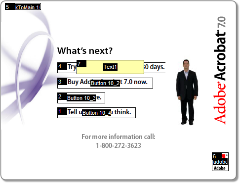
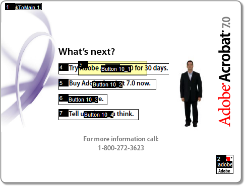
If you haven’t already seen it, take a look at Adobe’s walking talking PDF tour of Acrobat 7.0. It’s one of the most creative PDF files I’ve ever seen. (Don’t stop after the first few pages; there are some funny bits near the end.)

Obviously, a lot of work went into making this PDF, but the technical side of it is actually pretty simple. We can add some scripting magic to make it even better.
Take page 11, where our narrator explains the links he’s standing next to, pointing to each one as he describes it:

The links just sit there when he points at them. It would look good, and be a nice usability touch, if we could apply an Ajax-style fading highlight to each link as he points to it:

First we need to find out how the existing page works. If you have Acrobat Professional, you can see it by using the Select Object tool on the Advanced Editing toolbar. That’s a Flash movie on the right with the narrator in it. Right click it and open its Properties to see the Page Enter event and a .swf rendition (Acrobat’s term for a media clip and its associated settings):
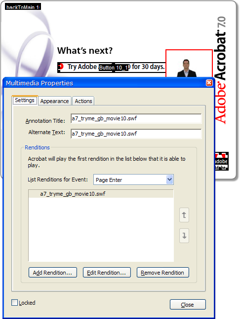
Each page is like this, with a Flash movie embedded in the page that runs on the Page Enter event.
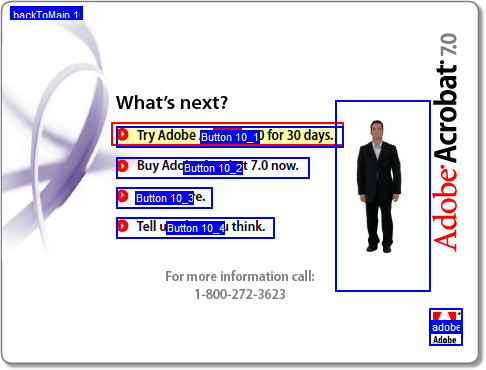
The links on the left are (no surprise) PDF pushbutton form fields.
With our narrator in a Flash movie and the links being PDF buttons, is there a way to connect the two? We can write some JavaScript code in the PDF to fade a highlight on and off for a link, but how do we trigger that code at the right time as the movie plays?
Well, one thing at a time. It would be fun to just see the fading highlight in action, so we’ll write that bit of code first and hook it up to a temporary button to test it. The code will use doc.getField(name) to get a JavaScript Field object, and then it can set the field’s fillColor property to change its background color. If we do that on a repeating fast timer we’ll have the fading highlight effect.
For a quick test before we write any code, we can right click one of the buttons and open its Properties to change its fill color manually:
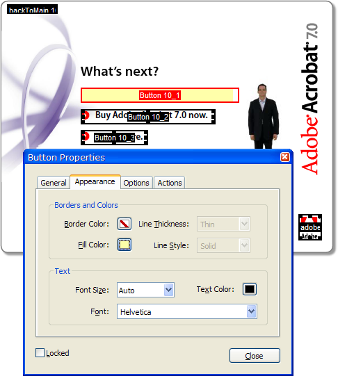
Oops. That worked, but it didn’t do what we want. We got the fill color but the icon and text went away. Let’s Undo it and try something else. (And note that the fill color doesn’t extend all the way to the right end of the field. That’s because the Flash movie overlaps the field. Hopefully this won’t cause any problem.)
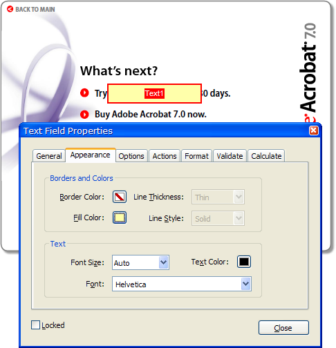
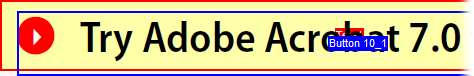
We can create a separate field that is a solid rectangle, and if we get the Z-order right it should do what we want. A text field with no text in it will do the trick. Let’s try it without worrying about the exact layout first:
I guess that’s some kind of progress. Maybe changing the Z-order will fix it. The tool to change that is tucked away in Acrobat’s Advanced/Forms/Fields/Set Tab Order menu command:
Now we can click on the fields in order to set their tab order (which is also their Z-order), and if we put the text field in the tab order before the button, we get the transparent background highlight we were looking for:
Finally, we move and resize the text field and we have our field highlight, at least in static form. Here’s the page after a Select All (Ctrl+A) to show all the field rectangles:
Creating a separate text field for the highlight was a minor nuisance, but does have one benefit: we were able to fine tune the highlight position relative to the button icon and text:
The blue outline is the pushbutton field that we tried to work with originally. As you can see, the pushbutton field rectangle doesn’t have consistent margins around the icon and text (and no margin on the left). With a separate text field—the red outline—we can adjust it so the highlight is positioned nicely:
Now that we have a highlighter field, we should be able to write some code to control it. While I was editing the field I changed its name from the default Text1 to Hilite, so we should be able to use getField and set its fillColor. Let’s try it in the JavaScript console first:
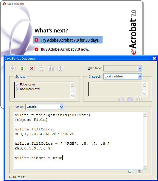
Looks good! We got a reference to the field in the hilite variable and looked at its current fillColor property. Then we changed the fillColor and the visible field changed as expected.
The last statement in the JavaScript console (not yet executed in the screen shot) hides the field, so we can save the file and it looks normal. It doesn’t matter that we left the field the wrong color; we’ll take care of that in the code that makes it visible again. For now, it’s time to save the file and take a break. In the next installment we’ll write some code to create the fading highlight effect.
p.s. Here’s an Acrobat editing tip: Open the General tab of Acrobat’s Preferences dialog and turn on the single-key accelerators. Then you can use the H key for “hand” (normal) mode in Acrobat, R for the object selector, and so on. Hover the mouse over a toolbar button to see its shortcut key. It makes this kind of editing a lot easier where you switch tools so often.
Disclaimer: I work for Adobe, but this is my own summer vacation project, not any kind of offical Adobe code.
Why I love the TrackPoint
 Ten years ago, when Windows 95 first supported multiple pointing devices, I tried an experiment: I set up three different pointing devices so I could switch back and forth among them and see which I liked. I already had a mouse, of course, so I bought a new IBM keyboard with a TrackPoint built into it, and a touchpad which I placed below the space bar.
 Essentially I had the same layout as IBM’s more recent UltraNav, plus a mouse.
At first, the TrackPoint felt a bit odd and hard to control, while the touchpad was easy to get used to. But after spending the money on that keyboard, I made myself use the TrackPoint for a few days… and then it clicked.
Once I got used to it, the TrackPoint became so natural that I wasn’t aware of using it. If I wanted the mouse pointer to go somewhere on the screen, it would just go there. I didn’t think about taking my hand off the keyboard, reaching over for the mouse, and then moving it. The mouse pointer would just go, seemingly because I willed it.
I was visiting a friend some time later and sat down to use their computer, and I started getting flustered because the mouse pointer wasn’t moving where I wanted it. In fact, it wasn’t moving at all, and I couldn’t figure out why. Why wouldn’t it just go like it usually did?
Then I looked down and saw my index finger moving around, trying to push on a TrackPoint that wasn’t there.
Because the TrackPoint is available in the touch typist’s home row position, it removes the barrier between pointing and typing. Consider how you operate a context menu: You can right-click with the mouse, move the mouse to the desired menu item, and click it. Or if you’re a real geek, you may know that you can type Shift+F10 to open the context menu, then press a shortcut letter or the cursor keys and Enter.
What you’re unlikely to do is combine these two modes of operation. You probably won’t right-click and then type a shortcut letter even though that can be very convenient. But with a TrackPoint, mixing the keyboard and mouse are perfectly natural. I often right-click and then type a shortcut letter, or mix up the mouse and keyboard in other ways. I’m never in “typing mode” or “pointing mode” like I would be with a mouse or touchpad.
If the TrackPoint is such hot stuff, why isn’t it more popular? You’ve got IBM/Lenovo, Motion Computing, sometimes Toshiba and Dell, and who else? Every other notebook has a touchpad.
I think one reason is that first impression. A touchpad makes a better first impression than a TrackPoint–especially at a retail store where the TrackPoint cap is likely to be damaged or missing. The benefits of the TrackPoint don’t become apparent until you’ve had some time to get used to it.
It’s a shame, because for someone like me who points and types, points and types, points and types, there’s nothing like a TrackPoint.
Netflix freakout
Netflix has been freaking me out lately.
At lunch couple of weeks ago, a friend of mine recommended the Alfred Hitchcock classic Dial M for Murder. That night I logged into Netflix, and as usual, they told me You Have Recommendations! And right there at the top of the page was Dial M for Murder.
I thought that was a pretty good coincidence, but tonight I was reading Engadget’s article on the Robot Gunslinger from Westworld. I saw that movie years ago and thought I would check it out again. So over to Netflix, where of course You Have Recommendations!
No, it wasn’t Westworld. My top recommendation was The Magnificent Seven. And just before visiting Netflix, I’d read this line in the Engadget article about Westworld:
“Yul Brynner plays a robotic reproduction of Yul Brynner playing Chris from the Magnificent Seven.”
I think Netflix has hired someone to spy on my lunches and blog reading. There is no other possible explanation.
FriendsLight theme updated for Drupal 4.6
The previous version of the FriendsLight theme works with Drupal 4.5.2 but not with Drupal 4.6.0. Here’s an updated version for 4.6.0 (only—use the previous version for 4.5.2).
See this discussion for information about the code change in this version.
Update 1: There were several bugs in the previous version. It basically was not usable at all on 4.6. I merged in the code changes from the friendselectric theme to fix the problems with 4.6. The link above is to the fixed version. Sorry about that!
Update 2: The new version attached to this post fixes the ?q= bug noted in the comments.
Uncool ripple effect in Mac OS X Tiger Dashboard
Mike Sax reports on the new Dashboard feature in Mac OS X Tiger.
Two things struck me watching the demo movie:
Flipping the widgets over to enter settings on the “back” of them is a great idea. It ties together the settings panel and the normal display panel very nicely. OTOH, it wouldn’t help in a case where you’d like to see the effect of your settings immediately. What do you do then: Keep flipping the widget over back and forth until you have it the way you want?
When you drop a widget on the dashboard, it appears with a “cool ripple effect” (Apple’s words). To me, this was interesting the first time, annoying the second, and by the third time I was hoping I would never have to see that “cool ripple effect” again.
Why would a dashboard ripple anyway? Am I supposed to believe it’s a body of water? Maybe it wouldn’t be so annoying if it made the slightest bit of sense.
Lions in our trees
My little neighborhood made the news. An 80 pound mountain lion was shot down from a tree, three blocks from my home, on a street that I frequently take walks on.
Network follies
I have lost all faith in my own intelligence.
I’d brought my ThinkPad over to my manager’s office to demo some network code I was working on. I had a couple of virtual machines running on the NAT network, so they could see other machines on the LAN as well as the host and each other. I unplugged the network cable, took the machine a few doors down, turned on the wireless network, and showed off my new code. Or tried to anyway. One little problem: The VMs couldn’t see the rest of our network through the wireless link. The host ThinkPad could ping other machines via the wireless, but the VMs couldn’t.
I’m pretty sure I’ve switched between wired and wireless connections using VMs with NAT before and it’s worked OK, or maybe I’m imagining it. In any case, it wasn’t working today. I fiddled with a few things, even tried rebooting the VMs, but never got it to work. The two VMs could see each other with no problem, so I just ran the demo that way. It was all I really needed anyway–virtual machines are great for demoing network software without having to carry a network around. But it would have been fun to show the connection to the rest of the LAN as well.
It wasn’t until hours later that I realized how easy it would have been to solve the problem: we could have simply taken twenty seconds to walk back to my office! We didn’t have an extra network connection handy in my manager’s office, but obviously I had the one I’d just unplugged. There was no particular reason we had to do the demo in one place or the other.
You’ve never done anything like this, have you?