Drupal
Zach Harkey code test
GeSHi filter test, changing languages in midstream.
Source code:
<geshi php>
<?php if ($links): ?>
<geshi html4strict />
<div class="links"> <geshi php /><?php print $links ?><geshi html4strict /> </div>
<geshi php />
<?php endif; ?>
</geshi>
Result:
Blog on Drupal now
We’re up and running with a Drupal version of the blog now. This probably means the RSS feeds will have duplicate entries—and that may happen again as I do some touchup editing to make the old entries display correctly. Sorry about that!
One of the deciding factors was the slick GeSHi syntax highlighter, which I tweaked up a bit to do zebra stripes. Those really help keep code readable when lines wrap in a narrow window. Check out the code samples in this page, and try making the window narrow to see the zebra stripes do their thing. (Alas, they only appear when you go to the site, not in the RSS feed.)
The code syntax highlighting works in comments too. I may change the <geshi> tag; that’s a bit of an experiment to get GeSHi and Markdown to work together.
More about the conversion later, time to call it a night!
WordPress spam fiasco
I’ve been thinking about moving this blog from WordPress to Drupal. I use Drupal for other sites, and with some of the contributed modules it has features that would be handy here.
Last week I ran a test conversion using Sam Revitch’s WordPress-to-Drupal conversion script. Everything carried over to Drupal beautifully, even the custom URL setup, but I noticed there were nearly 2000 comments in Drupal—a lot more than I’d ever seen on the blog or in the WordPress admin pages. I looked in the WordPress database with phpMyAdmin and found the extra comments in there, flagged with comment_approved = spam. Most of those really were spam, but there were a couple dozen legitimate comments that had been mistakenly tagged as spam.
That wouldn’t be so bad if the WordPress admin UI had given me any clue that these false positives (and the actual spam comments) were hiding in the database. But they don’t show up anywhere in the admin pages. The first time I ever noticed them was when the conversion script copied them over. (I suppose that could be considered a bug in the script—should it copy spam-tagged comments? But I’m glad it happened or the comments might have been lost completely.)
So, to the couple dozen people who posted comments and never saw them appear (nor any reply from me or anyone else), my sincere apology. They will show up when I straighten this out.
That would have been a week ago, except that once I saw the blog in Drupal, I asked myself if I was sure I didn’t want to try Typo—mainly because I’ve been itching to do something with Ruby on Rails, and a good way to learn a new language or framework is to start with an existing application and make some changes to it.
So far the results are mixed. Typo is a lot of fun and it has most of what I need in a blog, and coding some of the missing features would be educational. Actually getting to where you can test and deploy a Rails app like Typo is a total pain. With Drupal (or WordPress) I can have a basic site up and running in a few minutes on just about any hosting setup—including XAMPP on any handy Windows PC. Just unpack the tarball, edit the configuration file, create the database, and go to town.
But even on a Rails-friendly host like TextDrive, setting up a Rails app is downright scary, at least if you use Lighttpd like everyone says you should. I can see where there’s a market for a specialized hosting service like RailsAppHosting!
I couldn’t get Typo to run reliably on a Windows machine, so I built a Debian virtual machine and have been running it there. But it freezes many times a day. It won’t load any pages, nothing shows up in the console log. Other apps on the Debian machine respond normally. After a minute or two, Typo wakes up from where it left off. I figured this is probably just something about the virtual machine, maybe the fact I’m running Rails under Webrick or something, but then I saw this thread on TextDrive which has me worried.
I suppose I could just fire up the Drupal site and be done with it, and find some other project to learn Rails with.
FriendsLight theme updated for Drupal 4.6
The previous version of the FriendsLight theme works with Drupal 4.5.2 but not with Drupal 4.6.0. Here’s an updated version for 4.6.0 (only—use the previous version for 4.5.2).
See this discussion for information about the code change in this version.
Update 1: There were several bugs in the previous version. It basically was not usable at all on 4.6. I merged in the code changes from the friendselectric theme to fix the problems with 4.6. The link above is to the fixed version. Sorry about that!
Update 2: The new version attached to this post fixes the ?q= bug noted in the comments.
FriendsLight theme with styled preview
If you’re like me, you’ve lost your work in Drupal a few times when you’ve previewed an edit and then forgotten to save it. Drupal’s preview page hardly looks any different from a normal display page.
When my boss lost his work because of this preview page confusion, I figured I’d better do something about it, so I updated the FriendsLight theme to highlight preview pages visually. I posted some screen shots on my blog. Or, you can try the new theme out by entering a comment to this post and previewing it.
Unfortunately, Drupal does not provide any information to its themes to tell them they are rendering a preview and not a fully saved message. Fixing this requires changing the Drupal core modules node.module and comment.module, but it’s a straightforward one-line change in each. The code simply adds $node->preview and $comment->preview flags which can be tested in a theme or theme engine.
Drupal preview confusion
If you use Drupal, you’ve probably had this happen: You edit a post, preview it and double check it to make sure it’s perfect, and then come back later to find all your work is gone. Then you remember: You didn’t actually save your post, you just previewed it.
I’ve done it more than a few times. But when my boss had it happen to him on our new in-house Drupal site, I figured I’d better do something about it.
There are two problems here, one architectural and one cosmetic. The architectural problem is that Drupal, like so many web-based systems, does not save your work on the server at all when you are editing and previewing. If you just preview and forget to save, your work is lost.
That would take some design effort to fix, but maybe we can fix the cosmetic problem: Drupal’s preview page looks too much like a normal page view.
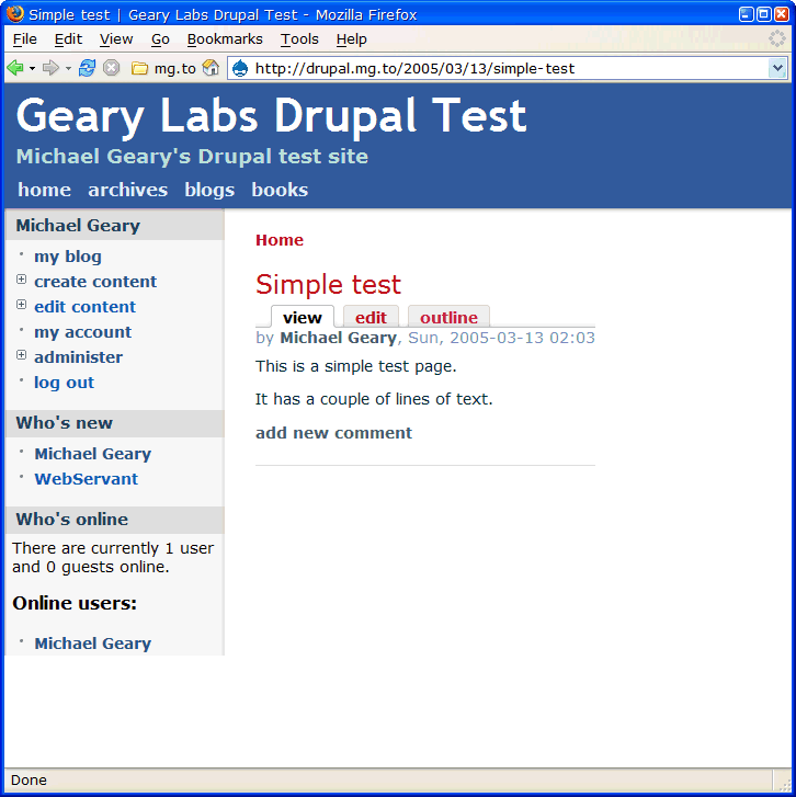
Here’s a typical Drupal page:

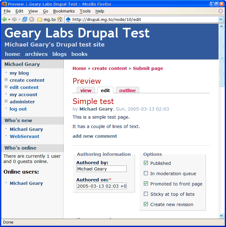
If you edit the page and preview it, it looks like this:

This hardly looks any different from the regular page display. No wonder it’s easy to forget to save the page.
One would think we could use a little bit of CSS in a Drupal theme to style the preview differently. But in searching the Drupal 4.5.2 and 4.6.0RC code, I couldn’t find any way to do this. Drupal just doesn’t mark the preview in any way that I could find to make use of from CSS.
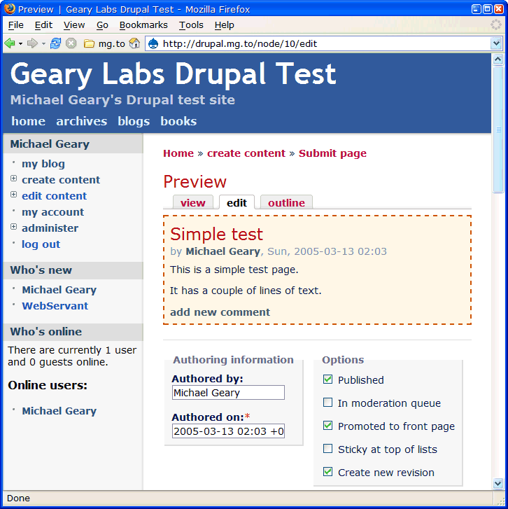
But if we add one line of code to a couple of Drupal core modules, we can then do a bit of work in the Drupal theme to get this preview page:

With the heavy dashed red border and shaded background, the preview won’t be mistaken for an ordinary display page.
Coding details and an updated version of the FriendsLight theme are on my Drupal test site.
TextBar Drupal module for Markdown and Textile
Here’s a treat for Drupal users who support the Markdown and Textile input formats on their sites. The TextBar module adds a formatting toolbar for these input formats to Drupal’s content and comment texarea fields.
To try out the TextBar right now, you can comment on this message. (You don’t need to save your comment unless you want to :-) but you’ll be able to try out the toolbar while editing it.)
You can try it with both the Markdown and Textile input formats (and if you select the Filtered HTML format the toolbar will disappear). The Textile input filter is not actually installed on this site, though, because of a conflict between the Markdown and Textile modules. So you won’t be able to actually post a comment in Textile, but you can see how the TextBar generates Textile codes.
New version of FriendsLight
I turned off the page border completely. I think it looks a lot better this way. Also turned off the underline for hover, and replaced the gradient fill in the heading with a solid color. The gradient fill probably looks great on a CRT, but on my ThinkPad it is streaky and distracting.
Will revisit the other issues later.
Here’s the new version. Enjoy!
New Drupal themes
Steven Wittens has put together a nifty new Drupal theme called FriendsElectric. Here’s a discussion about the theme and a live demo.
Inspired by Steven’s efforts, I made a few little changes to his theme and called it FriendsLight. It’s a work in progress, but I like it better than the other Drupal themes I’ve tried.
Drupal is my (current) favorite content management system for building community websites. I keep trying other CMSes but keep coming back to Drupal.
Bugs
There are always bugs, aren’t there? I noticed that my code to remove the right sidebar for admin and editing pages only works if you use clean URLs. I’ll fix it to work with either kind of URL. Also, the footer text seems too big and bold. Anything else I should fix while I’m at it?
FriendsLight Drupal theme
Here is what I changed in FriendsElectric to arrive at FriendsLight:
- Removed all the negative character spacing to make the text easier to read.
- Replaced the graphic margins with a smaller white margin all the way around.
- Moved the footer text into the main column instead of below the left sidebar.
- Made the footer text larger and bold.
- Changed some of the link colors to make them less lipsticky.
- Added a light gray background color when hovering on most links.
- Removed the bullets on the “by Author” and “Author’s blog” lines in each post.
- Moved the “by Author” line up to the top of the post, below the title.
- Fixed a bug where short page content caused the sidebar shading to be lost.
- Lightened the text color of the primary and secondary links.
- Added code to remove the right sidebar on all admin and content creation/editing pages.
If you like these changes, thank Steven Witten for making a theme that is so easy to change. If you don’t like them, blame me. :-)